Creating A Gauge Chart
What are Gauge Charts
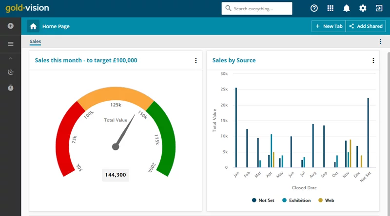
Gauge charts are a special type of Target Chart that measure the performance of Gold-Vision items e.g. Sales against a set goal. These charts are show users at a glance whether values are falling within an acceptable value or the outside acceptable value. Users can create Gauge Charts from for all areas in Gold-Vision excluding the Time object.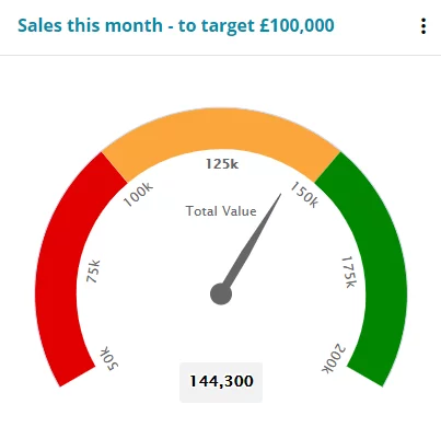
 Tip
Tip
We recommend that users state the actual target value in the chart’s summary e.g. Sales this month – to target £100,000
Gauge Chart Details
- the minimum value
- the maximum value
- the current value depicting how far from the maximum you are.
How to create a Gauge Chart
From the Gold-Vision list click on Views and then Report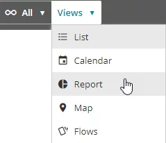
Click Create New Widget

Choose a Target Chart then select the type as Gauge Chart
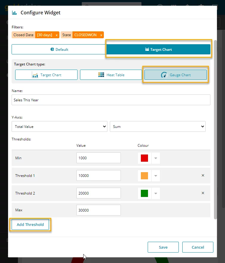
Add the Name for your chart and choose your Y-Axis
Add your thresholds and choose the corresponding colour then click Save
Once you have created your Gauge Chart you can pin this to your Home Page.
Click on the three dots on the right hand side of the chart enter the name of your chart and choose if you want to add it to an Existing or New Dashboard:
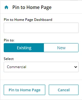
Click Pin to Home Page, and then your Gauge Chart will appear on your Home Page Dashboard
 Related articles